> ## Documentation Index
> Fetch the complete documentation index at: https://docs.userpilot.com/llms.txt
> Use this file to discover all available pages before exploring further.
# Email deliverability performance metrics
> The Analytics page helps you measure how your emails perform across all authenticated sending domains.
## Overview
The **Analytics** page helps you measure how your emails perform across all authenticated sending domains. These insights allow you to monitor deliverability, engagement, and potential issues, so you can maintain a healthy sender reputation and improve future campaigns.
## **Key metrics explained**
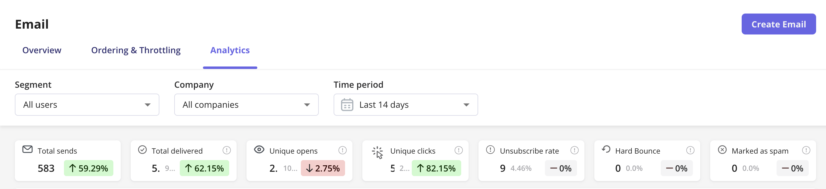
1. **Total sends:** The total number of emails sent from your domain within the selected time period. This helps you track overall sending volume.
2. **Total delivered:** The number of emails successfully delivered to recipients’ inboxes. High delivery rates indicate a well-configured domain and good sender reputation.
3. **Unique opens:** The number of unique users who opened your email at least once. This metric helps you understand engagement and subject-line performance.
4. **Unique clicks:** The number of unique users who clicked a link/button inside your email. Clicks reflect content relevance and call-to-action effectiveness.
5. **Unsubscribe rate:** The percentage of users who unsubscribed after receiving your email. A higher rate might indicate content fatigue or irrelevant messaging.
6. **Hard bounces:** The number of emails that couldn’t be delivered due to invalid, blocked, or non-existent addresses. Userpilot reports hard bounces only, temporary issues like full inboxes or server timeouts are excluded.
7. **Marked as spam:** The number of recipients who manually reported your email as spam. When this happens, Userpilot automatically stops sending any future emails to that user.
 **Note on filters and metric behavior**
The **Total sends**, **Hard bounce**, and **Marked as spam** metrics are **domain-level metrics**, meaning they reflect overall sending activity from your authenticated domain, not data tied to specific users, segments, or companies.
Because of that, these metrics remain constant even when you apply **Segment** or **Company** filters.
**Note on filters and metric behavior**
The **Total sends**, **Hard bounce**, and **Marked as spam** metrics are **domain-level metrics**, meaning they reflect overall sending activity from your authenticated domain, not data tied to specific users, segments, or companies.
Because of that, these metrics remain constant even when you apply **Segment** or **Company** filters.
They represent the total number of emails sent, bounced, or reported as spam **across your entire domain**, rather than filtered subsets of your audience.
## **Understanding spam complaints**
A **spam complaint** occurs when an email recipient clicks “This is spam” in their email client.
If Userpilot receives such a signal, that user will be **immediately excluded** from all future sends originating from your app or workspace to protect your sender reputation.
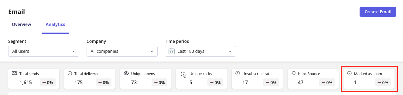 Userpilot can track spam complaints from **Yahoo** and **Outlook** accounts.
However, **Gmail** and **Apple Mail** do **not** share individual spam complaint events with third parties. These providers instead use **domain-aggregated reputation data**, meaning spam reports are combined at a broader domain level and not linked to individual recipients.
If you want to monitor your domain’s performance on Gmail, you can use **Google Postmaster Tools**, which provides detailed deliverability and spam rate insights for your sending domain.
## **Bounce rate details**
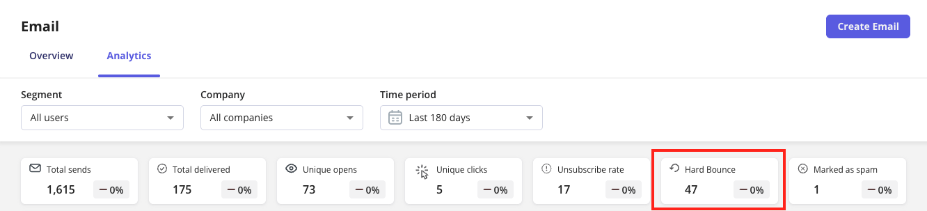
Userpilot’s bounce tracking focuses **only on hard bounces**, which represent permanent delivery failures (e.g., invalid email address).
Soft bounces, which are temporary issues like full mailboxes or slow servers, are not included to keep your analytics focused on deliverability health.
 ## **Performance graph**
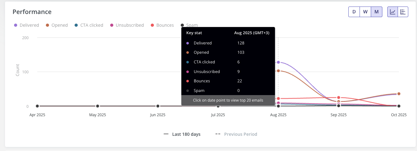
The **Performance** chart displays a timeline view of your emails’ key metrics, such as **Delivered**, **Opened**, **Clicked**, **Unsubscribed**, **Bounced**, and **Spam** over the selected date range (daily, weekly, or monthly).
## **Performance graph**
The **Performance** chart displays a timeline view of your emails’ key metrics, such as **Delivered**, **Opened**, **Clicked**, **Unsubscribed**, **Bounced**, and **Spam** over the selected date range (daily, weekly, or monthly).
Use this view to identify patterns, peak engagement periods, or sudden spikes in bounces or spam complaints.
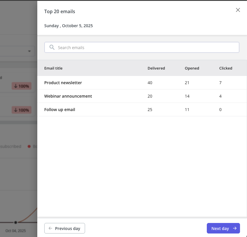
When you click on any data point in the **Performance** chart, a **side drawer** will expand, showing the **top 20 emails** sent on that specific date.
 This drawer provides a quick way to review how your top-performing emails behaved on that day, without needing to leave the analytics view. The side drawer lists the following columns for each email:
* **Email Title** - the name of the email as it appears in your campaign list.
* **Delivered** - the number of emails successfully delivered to recipients.
* **Opened** -the count of unique recipients who opened the email.
* **Clicked** - the count of unique recipients who clicked at least one link within the email.
The drawer focuses on **engagement metrics**, Delivered, Opened, and Clicked, because these are the most actionable indicators of how your email content performed.
Metrics like **Unsubscribed**, **Spam**, or **Bounced** are tracked at an aggregate (domain) level and are **not tied to individual emails** in a way that can be meaningfully broken down by day. Showing them per email could lead to misleading interpretations, especially when dealing with small send volumes or system-level events.
By keeping the drawer focused on the core engagement metrics, you get a cleaner and more consistent comparison of email performance trends over time.
This drawer provides a quick way to review how your top-performing emails behaved on that day, without needing to leave the analytics view. The side drawer lists the following columns for each email:
* **Email Title** - the name of the email as it appears in your campaign list.
* **Delivered** - the number of emails successfully delivered to recipients.
* **Opened** -the count of unique recipients who opened the email.
* **Clicked** - the count of unique recipients who clicked at least one link within the email.
The drawer focuses on **engagement metrics**, Delivered, Opened, and Clicked, because these are the most actionable indicators of how your email content performed.
Metrics like **Unsubscribed**, **Spam**, or **Bounced** are tracked at an aggregate (domain) level and are **not tied to individual emails** in a way that can be meaningfully broken down by day. Showing them per email could lead to misleading interpretations, especially when dealing with small send volumes or system-level events.
By keeping the drawer focused on the core engagement metrics, you get a cleaner and more consistent comparison of email performance trends over time.
 ## Unsubscribed count by subscription type
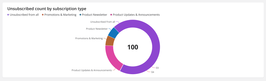
This chart displays the total number of users who unsubscribed from your emails, broken down by **subscription category**.
## Unsubscribed count by subscription type
This chart displays the total number of users who unsubscribed from your emails, broken down by **subscription category**.
Each color segment represents a specific type of email subscription, such as:
* **Product Updates & Announcements**
* **Promotions & Marketing**
* **Product Newsletter**
* **Unsubscribed from all**
The chart helps you understand which types of emails contribute most to unsubscribes, so you can adjust your communication strategy accordingly.
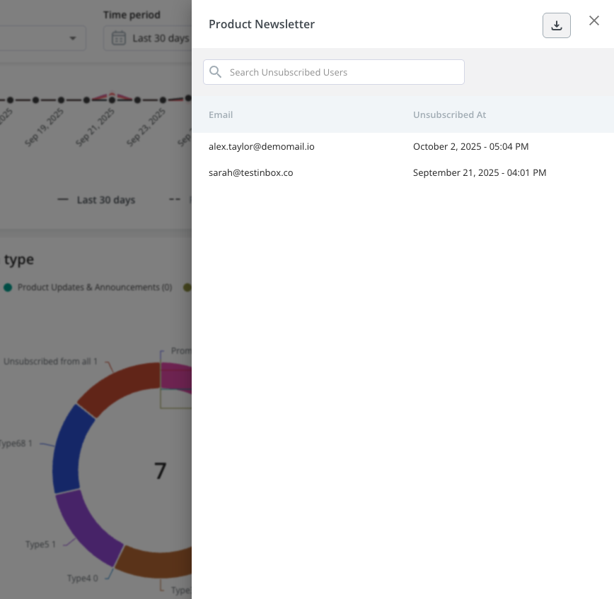
 When you click on any section of the chart, a **side drawer** will expand, showing the list of users who unsubscribed from that specific subscription type. The drawer includes:
* **Email** - the user’s email address.
* **Unsubscribed at** - the exact date and time the user unsubscribed.
You can also use the **search bar** at the top to find a specific user or export the list if needed.
When you click on any section of the chart, a **side drawer** will expand, showing the list of users who unsubscribed from that specific subscription type. The drawer includes:
* **Email** - the user’s email address.
* **Unsubscribed at** - the exact date and time the user unsubscribed.
You can also use the **search bar** at the top to find a specific user or export the list if needed.
 ## **Unsubscribe count explanation**
The **Unsubscribe Count** shows the total number of users who have opted out of a specific subscription type. This helps you understand how many users are no longer receiving emails under that category.
**Example:**
* If a user unsubscribes from **Promotions & Marketing**, the count for that category increases by 1.
* If you later change the unsubscribe type for a scheduled/published email (e.g., from *Product Newsletter* to *Promotions & Marketing*), the user who had opted out of *Promotions & Marketing* might still receive that email, since the unsubscribe category was changed after they unsubscribed.
* The **Unsubscribe Count** value will not reset. Userpilot keeps historical analytics data tied to the original subscription type.
**Important Note**
The unsubscribe data is tracked at the **domain level**.
## **Unsubscribe count explanation**
The **Unsubscribe Count** shows the total number of users who have opted out of a specific subscription type. This helps you understand how many users are no longer receiving emails under that category.
**Example:**
* If a user unsubscribes from **Promotions & Marketing**, the count for that category increases by 1.
* If you later change the unsubscribe type for a scheduled/published email (e.g., from *Product Newsletter* to *Promotions & Marketing*), the user who had opted out of *Promotions & Marketing* might still receive that email, since the unsubscribe category was changed after they unsubscribed.
* The **Unsubscribe Count** value will not reset. Userpilot keeps historical analytics data tied to the original subscription type.
**Important Note**
The unsubscribe data is tracked at the **domain level**.
That means Userpilot can identify that a user unsubscribed from emails sent through your domain, but it **can't determine which specific email** the user unsubscribed from if multiple emails were sent from the same domain.
This approach protects recipient privacy while still providing valuable insight into overall unsubscribe trends per subscription category.
[For any questions or concerns please reach out to **support@userpilot.com**](mailto:support@userpilot.com)